Revive Medical Spa
Generic teal template replaced with bespoke luxury aesthetic — loads in 1.5 seconds
Project overview
Client
Revive Medical Spa
Industry
Medical spa & aesthetics
Location
Denver, CO
Timeline
8 days
Services
Full website redesign
Treatment pages
Online booking integration
Mobile PageSpeed score
Mobile load time
Visual identity
The problem
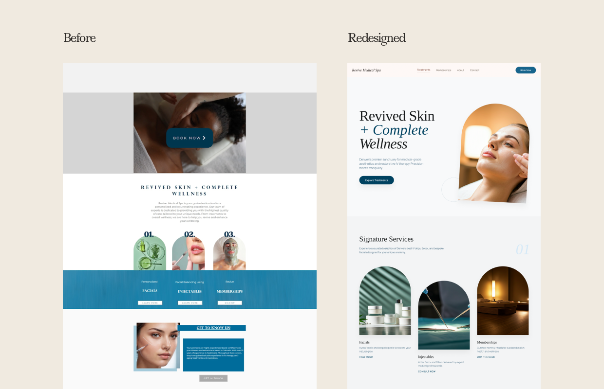
Revive Medical Spa offered IV therapy, injectables, bespoke facials, and membership wellness programmes — services that sit at the intersection of clinical precision and elevated personal care. Their website reflected none of this.
The existing site used a generic teal-and-white template shared by hundreds of med spas across the US. The hero was a stock photo of a woman receiving a facial with a large "BOOK NOW" button overlaid in the centre. The headline — "REVIVED SKIN + COMPLETE WELLNESS" — appeared below the fold in all caps, centred, with a small paragraph of generic copy underneath.
The service section used three numbered circles (01, 02, 03) — Facials, Injectables, Memberships — sitting over a flat teal background with identical "Learn More" links. There was no photography of the actual practice, no sense of the environment clients would be walking into, and no visual language that communicated luxury or clinical expertise.
The goal
Design a site that communicates the warmth, precision, and elevated experience that Revive's clients actually receive — and makes booking feel as natural as walking through the front door.
What we built
The redesigned site opens with warm, natural light photography — a close-up portrait of a client in treatment, shot in the golden, soft-focus style associated with premium wellness brands. The headline splits into two weights: "Revived Skin" in a clean serif, "+ Complete Wellness" in an italic, adding editorial tension that breaks the clinical template aesthetic immediately.
Below the hero, a "Signature Services" section uses arched image frames — a deliberate design choice that signals boutique, considered taste — to present Facials, Injectables, and Memberships as distinct lifestyle categories rather than a service menu. Each card has a one-line positioning statement and a unique CTA (View Menu, Consult Now, Join the Club) that matches the specific conversion action appropriate for that service type.
The overall palette is warm cream, dusty neutral, and deep amber — a significant departure from the teal template and a much closer match to how the practice positions itself to its clients. Online booking is integrated directly from the navigation.
“New clients tell us the website made them feel like they were in the right place before they even walked in the door.”
— Owner, Revive Medical Spa, Denver CO
Want results like this?
Book a free 30-minute audit call. We'll look at your current site and tell you exactly what we'd change and why.