Champion Chiropractic
Blog-first homepage rebuilt to convert visitors into booked consultations — 3,000+ patients surfaced
Project overview
Client
Champion Chiropractic
Industry
Chiropractic & wellness
Location
Multi-location
Timeline
8 days
Services
Full website redesign
Treatment pages
Patient portal integration
SEO setup
Mobile PageSpeed score
Mobile load time
Above-fold conversion path
The problem
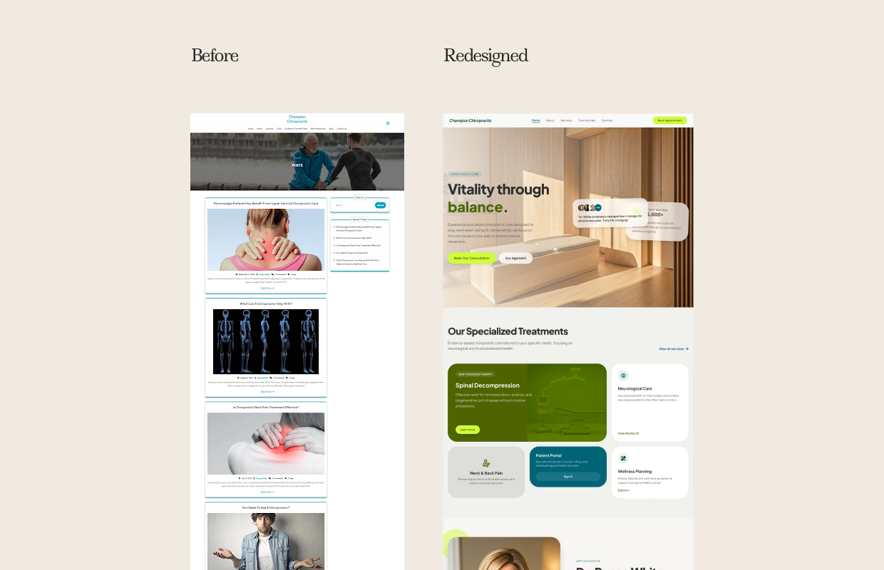
Champion Chiropractic's homepage was a blog. Not intentionally — but in effect, that's what visitors encountered. The page opened with a full-width banner image of a trainer and an older man exercising, and immediately below it: a search bar and a vertical stack of blog article thumbnails. These were good articles. But they were the wrong thing to put in front of someone visiting a chiropractic practice's homepage for the first time.
A patient with lower back pain or sciatica arrives at the homepage wanting to know: do you treat what I have, where are you, and how do I book? The blog homepage answered none of those questions without scrolling. There was no above-the-fold CTA, no visible booking button, no service summary. The treatments offered — Spinal Decompression, Neurological Care, Neck & Back Pain, Wellness Planning — were nowhere on the homepage.
A practice with clearly strong clinical credentials and a proven patient base was presenting itself as an information website, not a healthcare provider.
The goal
Redesign the homepage to lead with the practice's identity, treatment specialisations, and booking path — while preserving the content authority that the blog had built.
What we built
The redesigned homepage opens with a warm, full-width interior shot of the practice — natural wood, soft light, clean clinical space — that immediately communicates the environment a patient will walk into. The headline: "Vitality through balance." — with "balance" in a distinctive green accent that becomes the practice's visual signature throughout the site.
A social proof strip appears immediately below the hero: a patient quote preview and "3,000+" patients served, making the practice's track record visible within seconds of landing. The "Our Specialized Treatments" section below replaces the blog grid entirely — treatment cards cover Spinal Decompression, Neurological Care, Neck & Back Pain, and Wellness Planning — each with a short outcome-led description and a Learn More link to a dedicated page.
A Patient Portal card with Sign In functionality integrates directly into the treatment grid, making account access feel like a natural part of the patient experience. A provider portrait and biography section anchors the bottom of the homepage, establishing the clinical credibility that justifies the investment patients are considering.
“Our booking rate through the website has meaningfully improved. The redesign made it obvious that we're a serious practice.”
— Lead Chiropractor, Champion Chiropractic
Want results like this?
Book a free 30-minute audit call. We'll look at your current site and tell you exactly what we'd change and why.